RE Home Connect
Role: Brand Designer
Brief: Executive Leadership wanted the company to stand on it’s own with a distinct vibe for the online company. My role was to designed the logo and sub-branding for affiliate company of New American Funding that connected qualified/preapproved home buyers with local Real Estate specialists.
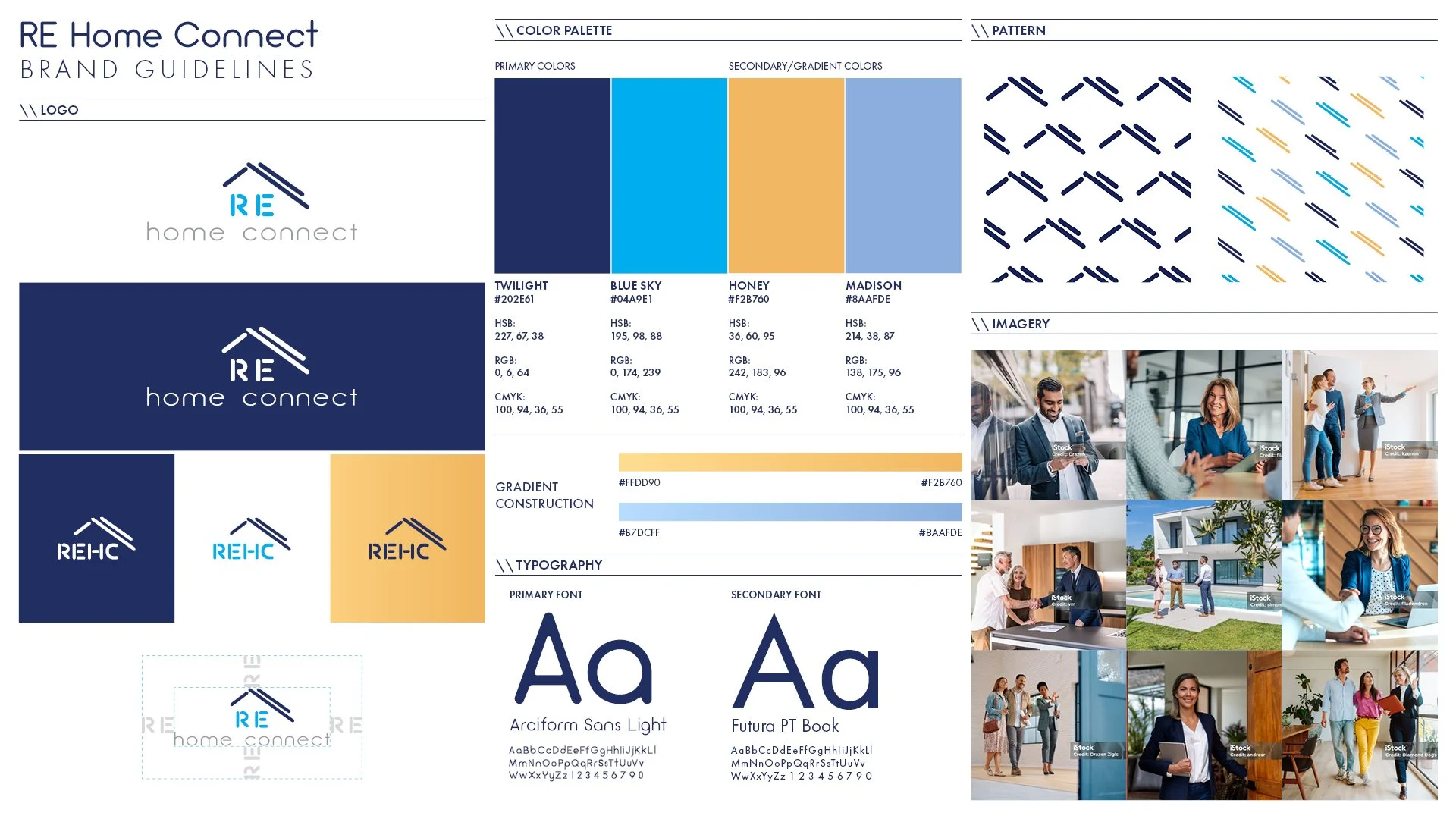
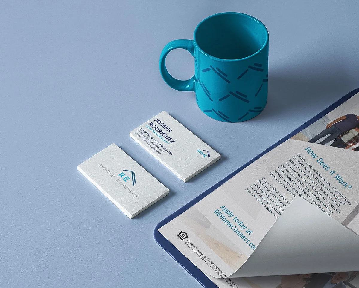
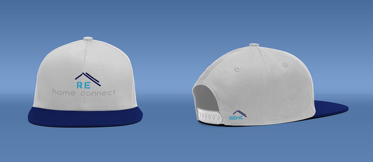
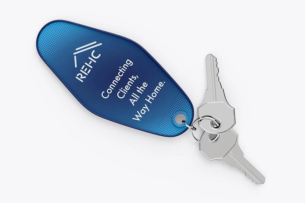
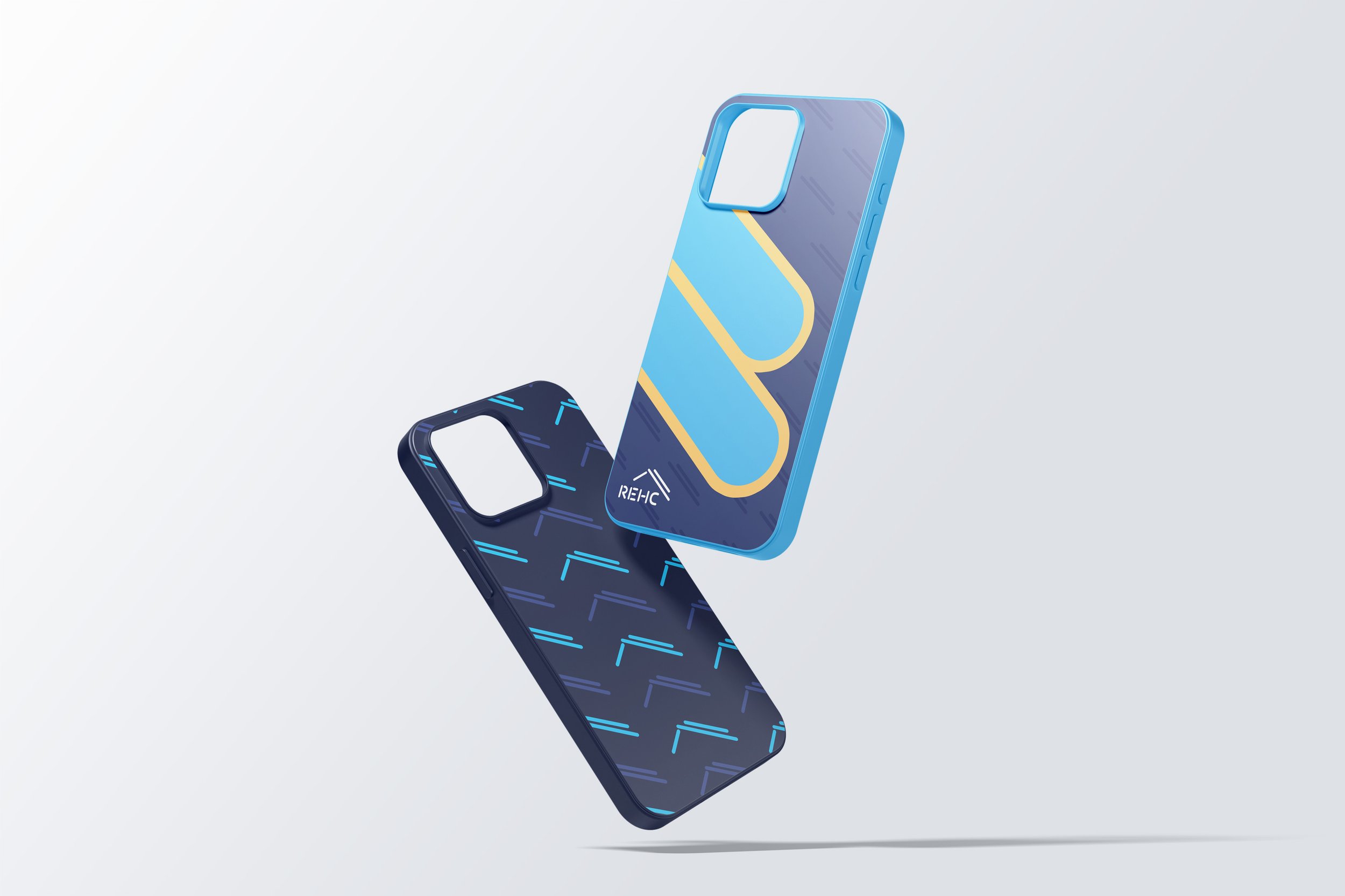
Deliverables: Brand Visual Identity - Main logo and variants, color palette, typography, photography and design elements (gradients and pattern).
Tools: Adobe CS
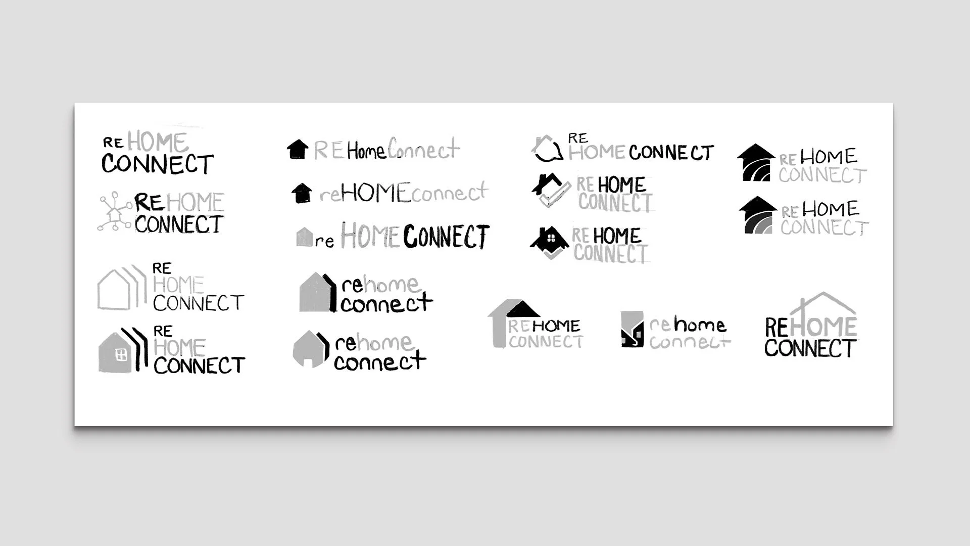
Initial Sketches
Like many in the residential real estate industry, they wanted a home image of some kind included in the logo, and a very friendly look. Hand-sketching in greyscale to focus on overall shapes and imagery, I came up with some iterations that leaned into concepts of connection - networking, talking, groups - as well as stylings of home icons.
Concepts
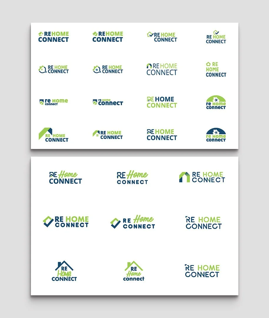
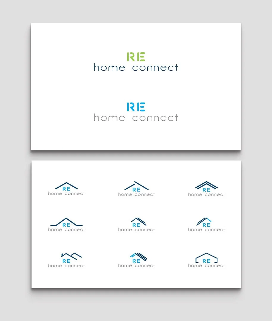
Initial concepts weren’t hitting the mark and stakeholders were unsure how to proceed. They knew they wanted a home visual but everything felt like it had been done before. I pitched we take a less common route and lean more into a minimalist/tech aesthetic since this was an exclusively online company and the mission of the company was to transform a physical and manual interaction into a digital platform. Leadership agreed with this shift and we landed in a much cleaner space.
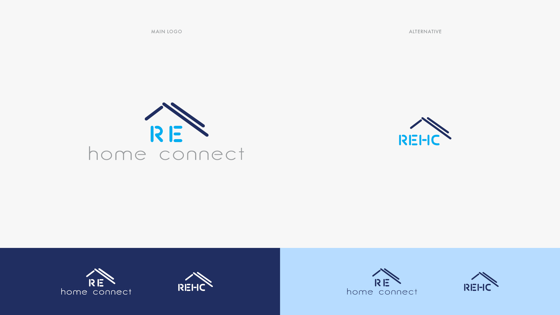
Final Lockup
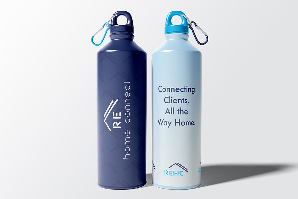
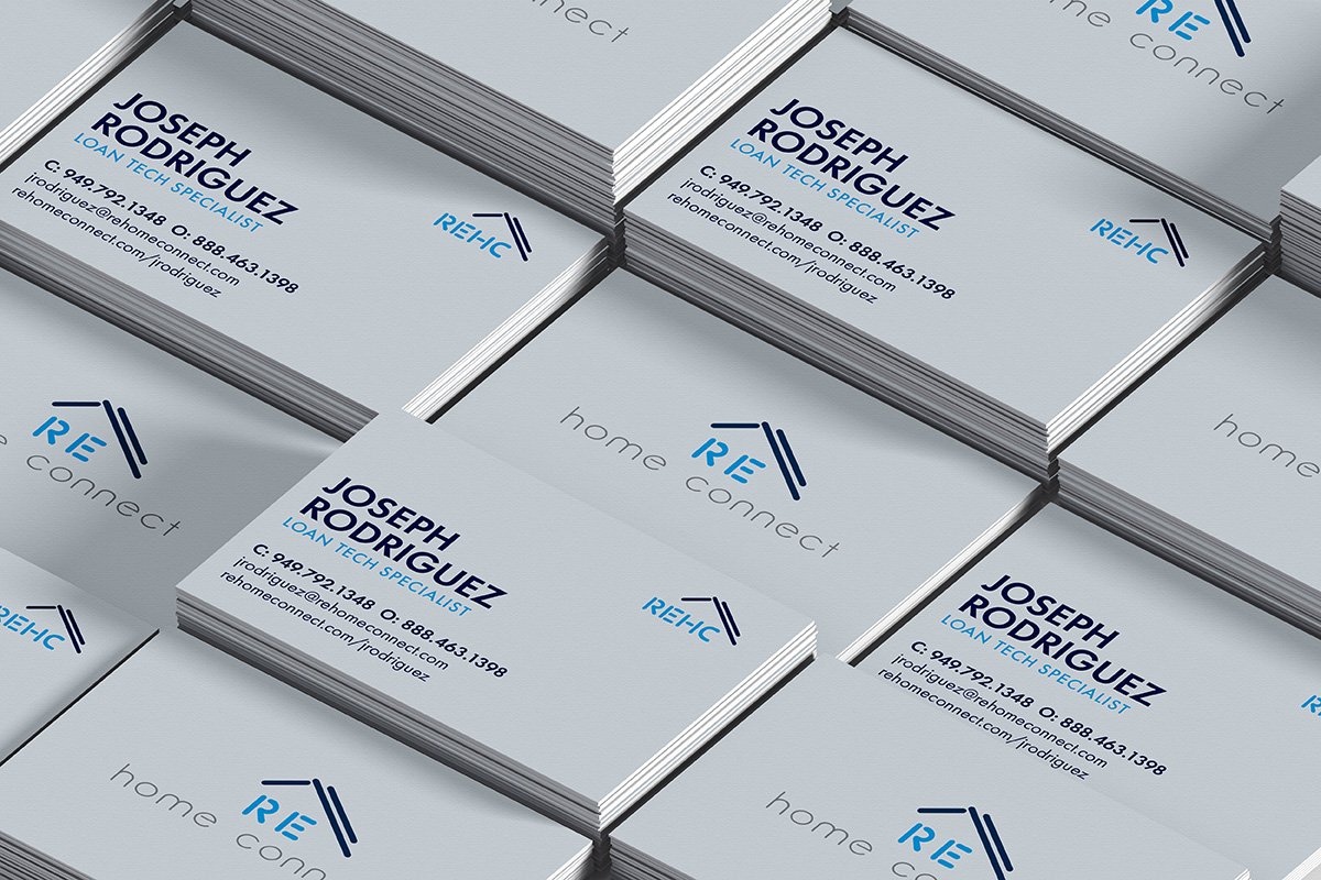
The final look was a hyper-minimalist look with a tech-forward feel. Fonts are streamline with a simplified pitched roof to recall the original wants of ‘home’. This element was extended into other parts of the brand identity to strengthen the design DNA.