Chispita Mexican Food & Bakery
A rebrand case study
The Idea
I’d been wanting to take on a personal branding project, something with a real-world design problem and enough room to have some fun. Then, over lunch at a local Mexican restaurant, I found my subject.
Chispita has been a local favorite for decades, serving both Mexican food and freshly baked pan dulce. Like many small businesses, its reputation and community presence had grown much stronger than its visual identity.
The goal was simple: create a cohesive identity that could honor what locals already loved while giving the business a stronger, more memorable presence. This project also gave me an opportunity to flex my brand design muscles and take an identity from strategy through execution.
The Ask
Create a cohesive visual identity, including a logo system, color palette, typography, brand elements, and real-world applications that brings both sides of the business together.
THE CHALLENGE
The biggest challenge wasn't creating something new. It was figuring out what was already there. Across Google, social media, signage, and in-store materials, the business appeared under several variations: “Chispita,” “La Chispita,” “Chispita Bakery,” and “Chispita Mexican Food.” Google Maps even treated the bakery and restaurant as two separate businesses.
The solution wasn't to pick one and discard the other. Both sides of the business had built recognition over the years, and both mattered. Chispita isn't a bakery that happens to serve tacos, or a restaurant that happens to sell pan dulce.
It's both.
So the new identity needed to bring those two sides together without erasing the name equity that already existed.
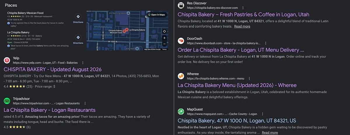
Google Search Results for Chispita Bakery.
NAMING
With the business offering both bakery and savory food, I wanted the naming system to give each side equal weight: Chispita Mexican Food & Bakery.
I also chose to lose the “La,” reflecting the original storefront signage and the way the name has historically appeared. The result preserves the familiarity customers already associate with Chispita while giving the brand a clearer, more cohesive structure.
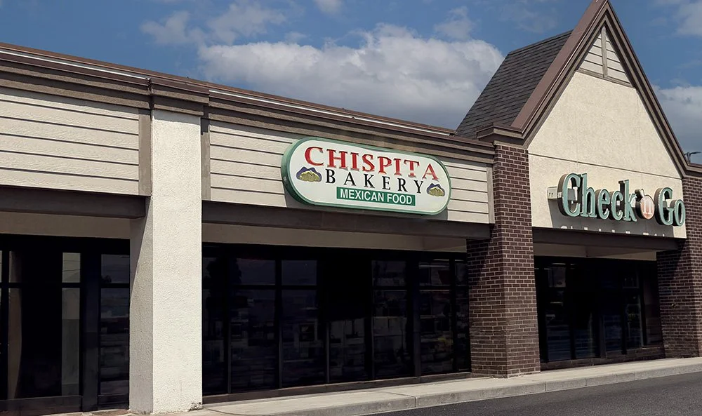
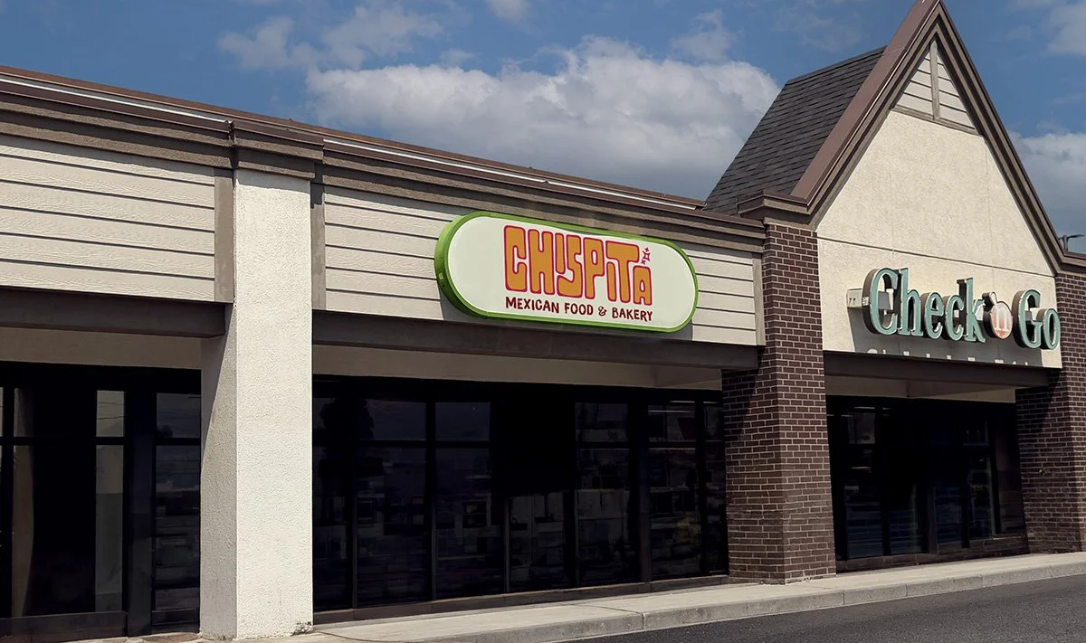
Exterior - Store front
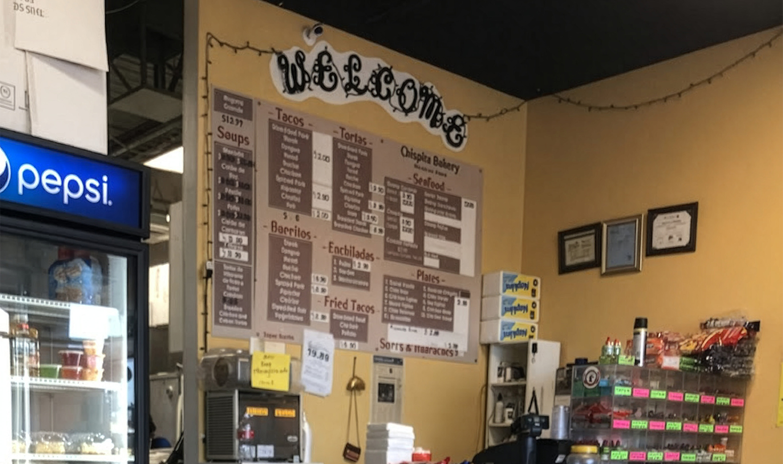
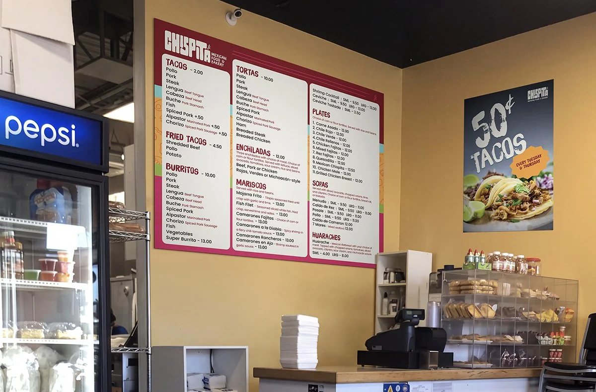
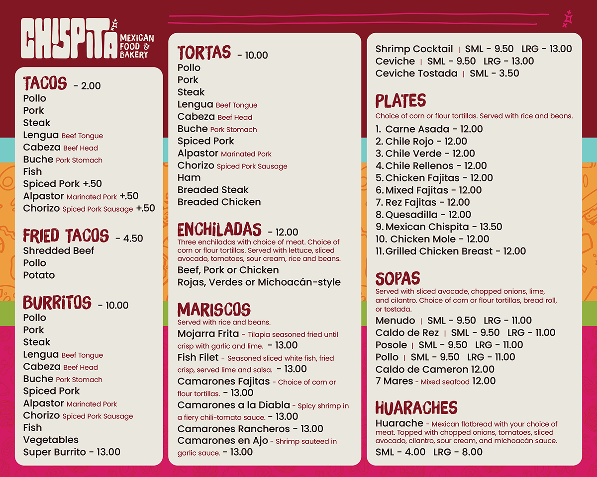
Interior - Menu board
Logo
“Chispita” is the diminutive form of chispa, meaning “little spark.”
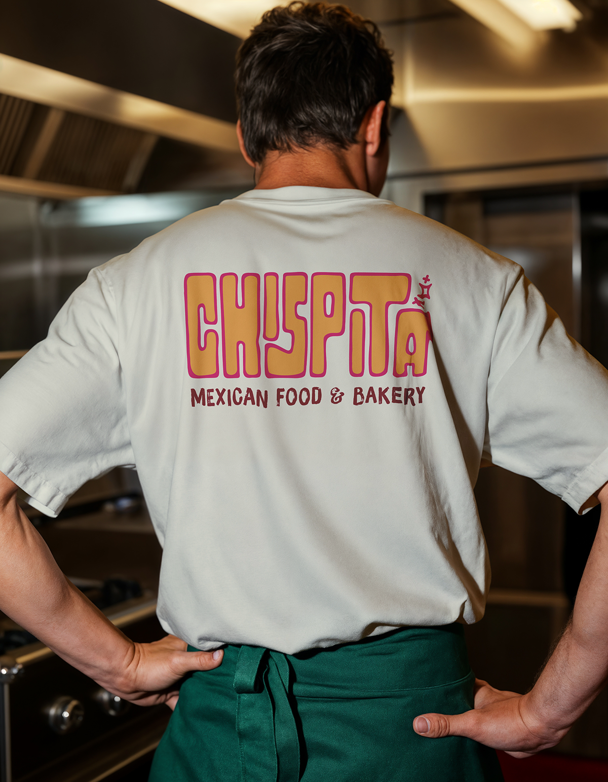
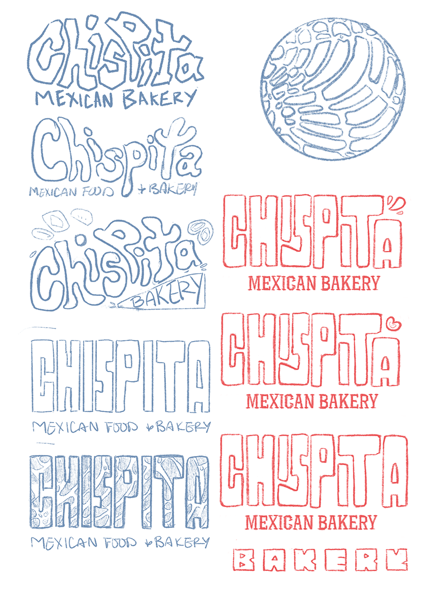
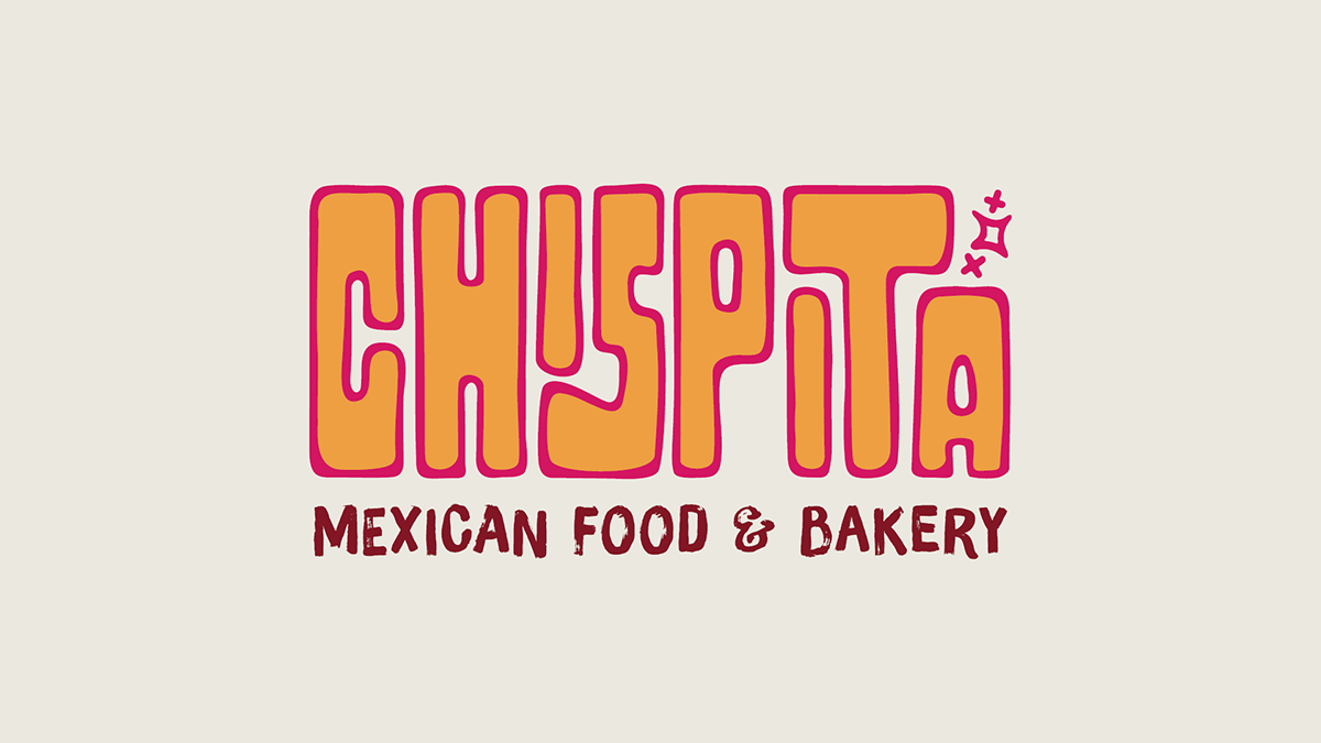
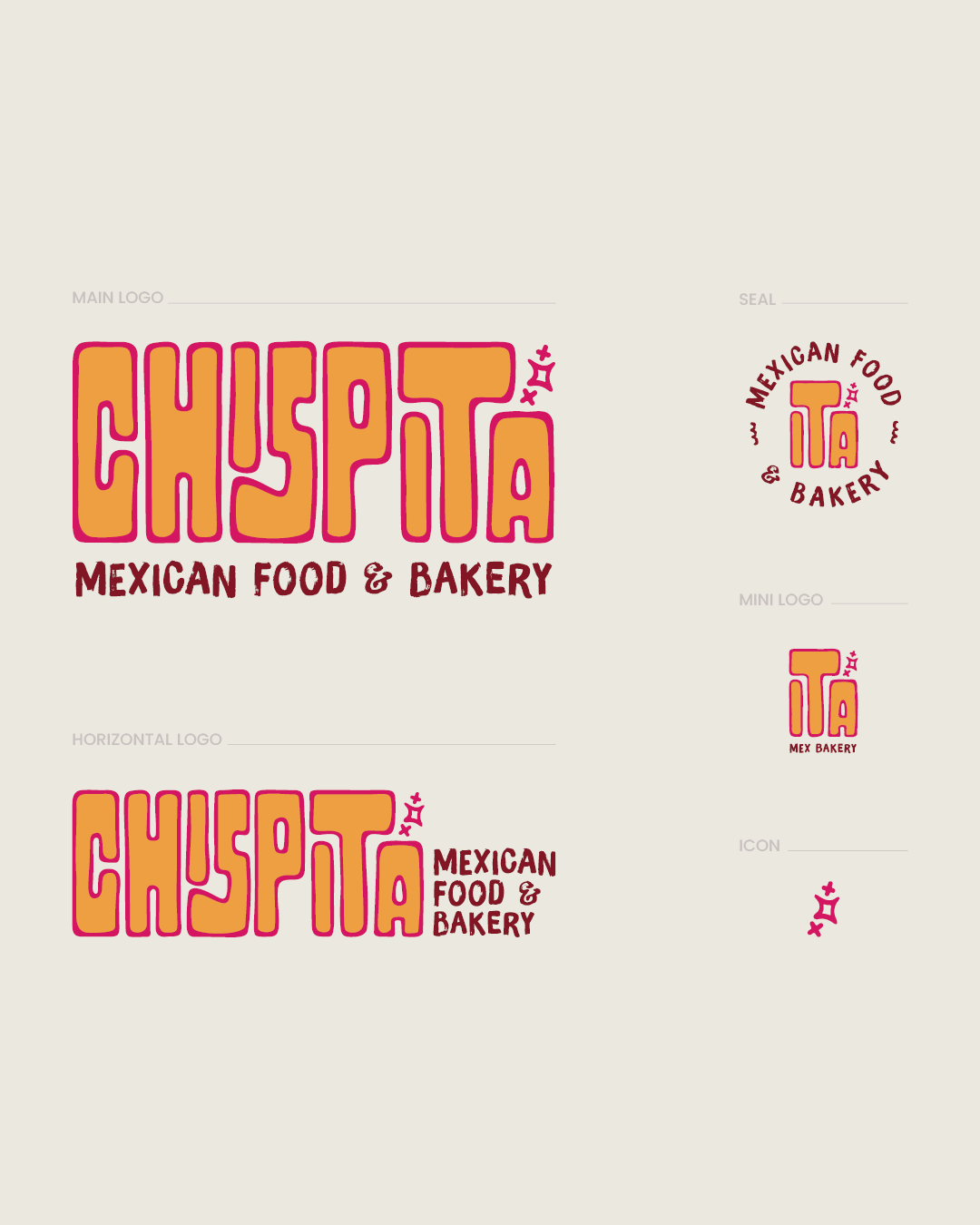
I wanted the wordmark to feel completely custom, so rather than modifying an existing typeface, I built it from scratch. The first concepts explored a lighter, floating quality, but the forms weren't quite right. Looking at the brand through the lens of its food led me somewhere more interesting: the cracked, sugary surface of a concha. I translated those organic, swirling forms into a chunky custom wordmark with tightly interlocking letterforms. The result feels playful and distinctly Chispita without relying on obvious food imagery.
The spark icon reinforces the name and doubles as a flexible standalone mark.
Identity
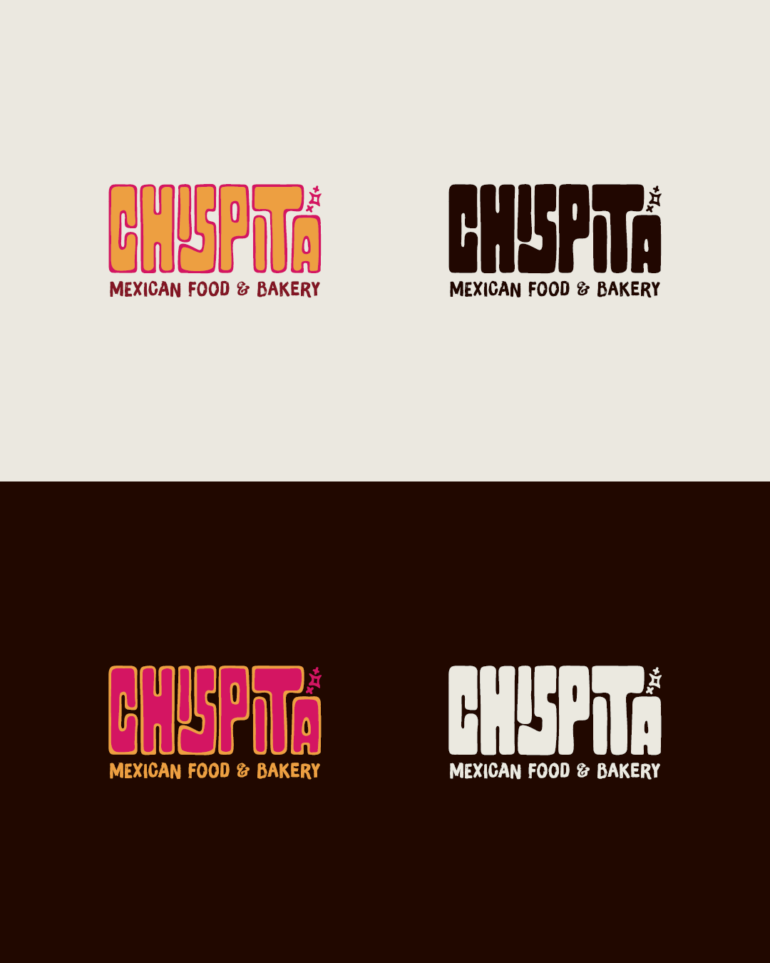
The identity system gives equal weight to both sides of the business, with “Mexican Food” and “Bakery” working as complementary descriptors.
A secondary mark uses the diminutive “-ita” more prominantly. I intentionally kept this version out of primary brand applications, instead reserving it for smaller touchpoints like napkin stamps, employee nametags, and social imagery.
The spark icon also works independently as a profile image, favicon, or small-scale brand mark.
Visual Language
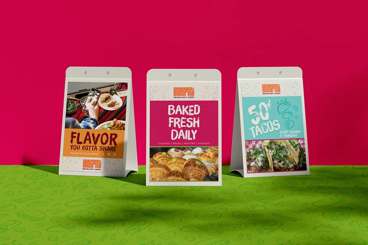
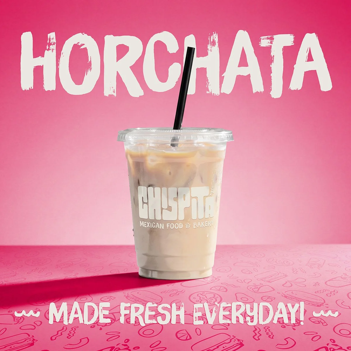
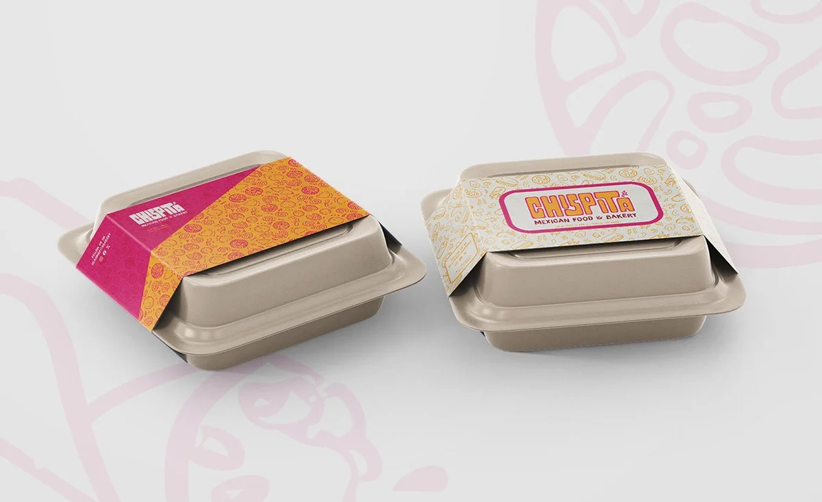
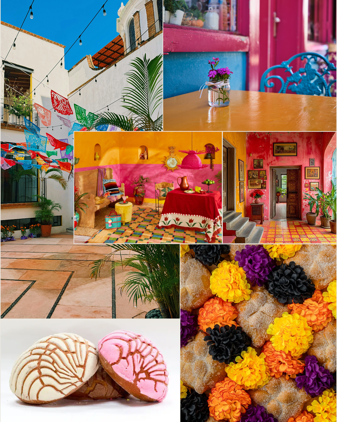
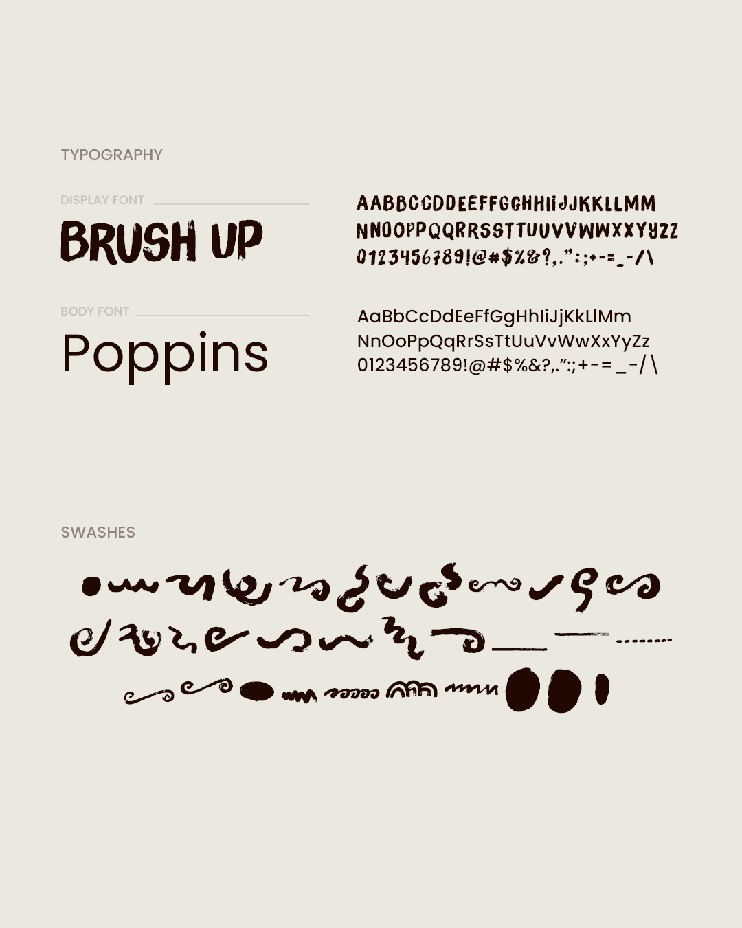
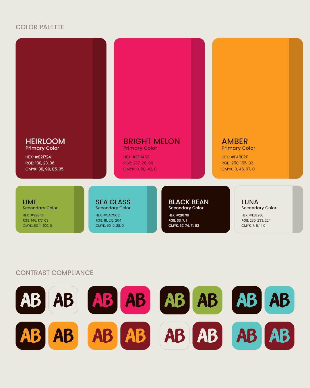
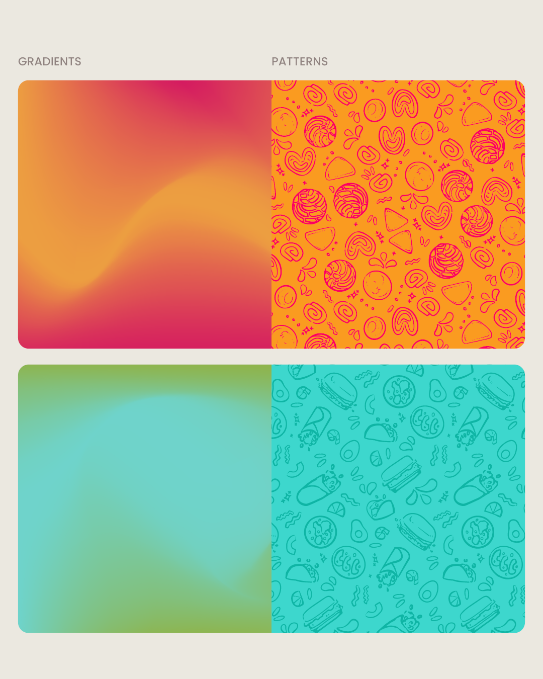
The color palette draws from the vibrancy of traditional Mexican visual culture, while the typography balances personality with readability. Hand-drawn patterns extend the identity beyond the logo and give the system a more tactile, made-for-Chispita feel.
Brand in Action
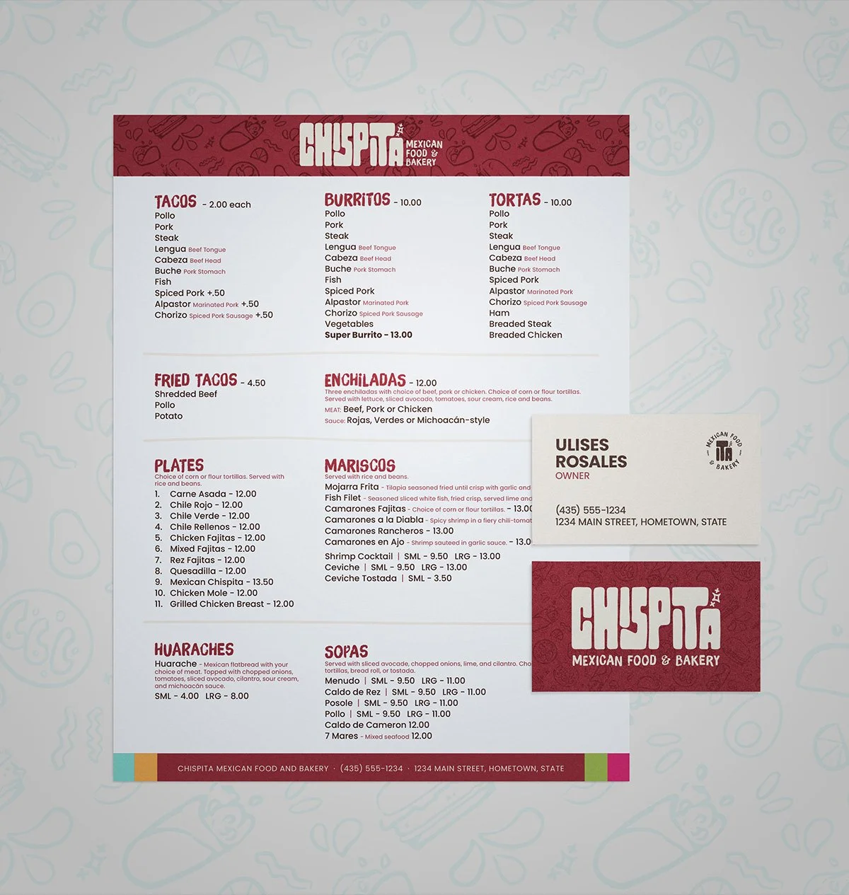
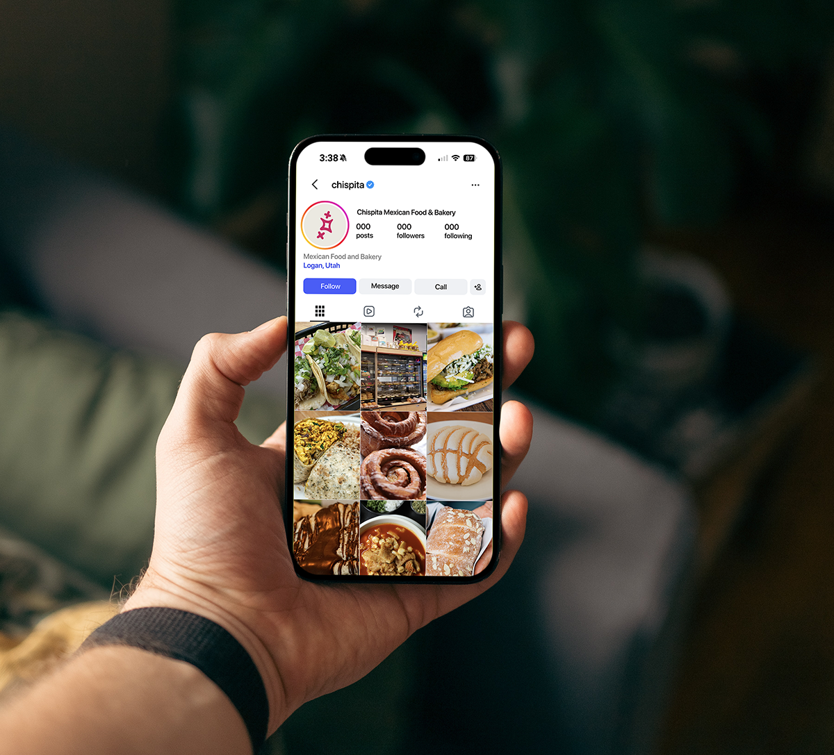
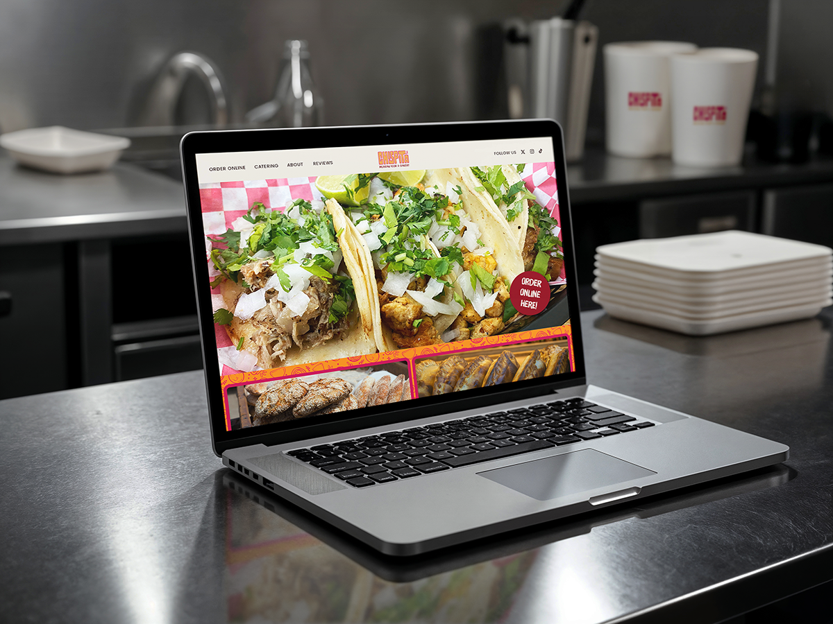
The final system was designed to work beyond a logo on a page. From menus and packaging to signage, social media, and other everyday touchpoints, the identity creates a more consistent experience while leaving plenty of room for the food and the personality of the business to shine.